

Custom Printed Stand Up Pouches: Top 10 Designs for Your Brand
2026-08-01
Looking to make your brand stand out on crowded shelves? Custom printed stand up pouches are the secret weapon for eye-catching packaging. At Kody, we know that the right design can turn a casual browser into a loyal customer. In this blog, we’re unveiling the top 10 pouch designs that blend creativity with practicality—whether you’re after bold colors, eco-friendly vibes, or minimalist chic. Ready to discover the perfect style that screams your brand’s personality? Let’s dive in.
Why Stand-Up Pouches Are Turning Heads in Retail
Walk down any modern store aisle, and you’ll notice something different—pouches that stand upright, flaunting bold graphics and clean lines. These aren’t just another packaging fad; they’re a response to how people actually shop. Shoppers are drawn to the way these pouches sit neatly on shelves, presenting a front-facing canvas that feels less like a container and more like a billboard. The rigid bottom gusset gives them stability, so they don’t slump over or disappear between boxes. It’s a small engineering shift that makes a product pop, catching eyes that are tired of uniform cans and cartons.
Beyond the shelf appeal, something else is at play: the sensory experience. The matte or glossy finishes, the soft crinkle, the easy tear notches—these details trigger a subtle sense of quality. People pick them up, feel the textured surface, and instantly perceive the contents as fresher or more premium. It’s a psychological nudge that standard rigid packaging rarely achieves. Resealable zippers and spouts turn a simple packet into a useful object that stays in kitchens and bags longer, creating repeated brand encounters that no static box can replicate.
Retailers are also waking up to the hidden advantages. Stand-up pouches weigh less and take up less space during shipping, which quietly trims logistics headaches without a whisper of eco-marketing. Their embedded layers of film protect against moisture and oxygen just as well as heavier alternatives, meaning products last longer on shelves and in pantries. This blend of practicality and shelf dominance is why you’re seeing them replace jars, bottles, and even traditional bags—not because someone shouted “innovation,” but because they simply work better in the real-world jostle of retail.
Minimalist Looks That Let Your Brand Breathe
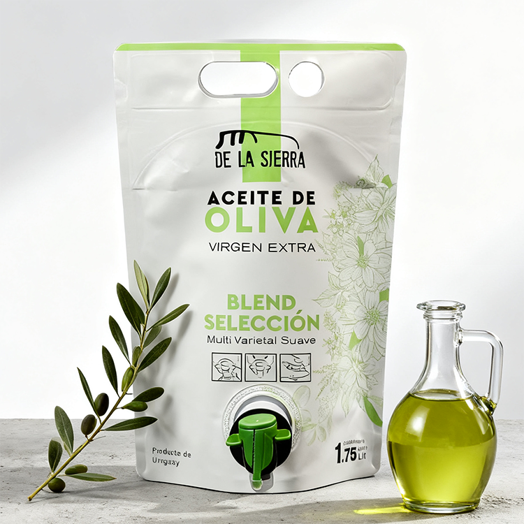
A cluttered visual identity can suffocate your message before it ever reaches your audience. When every pixel fights for attention, nothing stands out. Minimalist design strips away the non-essential, giving your core values the space they need to resonate. It's not about being plain; it's about being intentional. By limiting color palettes, choosing clean typography, and embracing negative space, your brand communicates confidence and clarity.
Think of it as visual breathing room. Just as a well-paced conversation includes pauses, a minimalist brand leaves room for the eye to rest and the mind to absorb. Without competing elements, your logo, tagline, or hero image becomes the natural focal point. This simplicity fosters trust—it signals that you have nothing to hide and everything to say with quiet authority.
Ultimately, this approach invites your customers into a calmer, more focused brand experience. In a world saturated with noise, a brand that breathes is a brand that remembers why it exists. Each element serves a purpose, and that purpose is felt, not explained. Minimalism isn't a trend; it's a commitment to saying more with less.
Bold Illustrations That Tell a Story at First Glance
Some illustrations hit you the moment you lay eyes on them—they don’t just decorate, they declare. Through daring color choices, unexpected compositions, and characters frozen in mid-action, these images bypass explanation and pull you straight into a narrative. A single frame can imply a before and after, a conflict or a transformation, all without a single word. The boldness isn’t necessarily about loudness; it’s about confidence. It’s the artist’s ability to strip away noise, isolate the core emotional beat, and serve it up in a way that feels both immediate and unforgettable.
What makes such illustrations resonate isn’t just technical skill—it’s the deliberate tension between what’s shown and what’s left unsaid. Maybe it’s a splash of red in a monochromatic scene, a character looking off-canvas with an expression you can’t quite categorize, or a surreal juxtaposition that makes your brain lean in. This is storytelling that doesn’t wait for permission; it sidesteps the rational mind and connects directly with instinct. Whether for editorial work, book covers, or personal projects, these pieces remind us that sometimes the most powerful stories are the ones we feel before we fully understand them.
In a world flooded with disposable images, a bold story-driven illustration demands a second glance, then a third. It invites you to invent what happens next, making you a co-conspirator rather than a passive viewer. The best examples never explain themselves—they trust the audience to fill in the gaps, turning a static picture into a living, breathing moment. And that’s the magic: when an artist dares to leave room for the imagination, the illustration stops being just a picture and becomes an experience.
Transparent Windows That Build Instant Trust
When someone visits your site, the first thing they want to know is whether you're legit. A transparent window—whether it’s a live chat widget, a recent activity feed, or a clear pricing breakdown—lets them peek behind the curtain instantly. It’s not just about disclosure; it’s about showing you have nothing to hide. That tiny moment of openness is often enough to tip the scales from hesitation to curiosity.
People trust what they can see and verify for themselves. Unscripted social proof—like showing real-time usage stats or customer names as they sign up—cuts through the noise of generic testimonials. It feels spontaneous, not staged. The key is to make the window genuinely transparent, not a polished mask. When visitors sense they’re glimpsing something real, their guard drops faster than any sales pitch could manage.
This approach flips the old playbook. Instead of demanding trust, you build it by simply offering visibility. A hesitant user watching a live counter of active members, or a map of ongoing orders, begins to think, “If so many others are here, I’m in the right place.” There’s no need to over-explain—the transparency speaks for itself, transforming skepticism into confidence within seconds.
Matte Finishes That Feel Premium to the Touch
There’s something quietly luxurious about running your fingers over a surface that feels soft and velvety, yet looks completely dry. Unlike glossy coatings that scream for attention, a well-executed matte finish invites you to lean in closer, rewarding that curiosity with a smooth, almost buttery texture. It’s a tactile experience that transforms ordinary objects into objects of desire, making every touch feel intentional and refined.
The secret often lies in the way light scatters across the surface. Instead of bouncing back sharply, a matte finish diffuses reflections, which naturally softens the visual profile while the physical feel remains impeccably smooth. This isn’t about being dull or lifeless—it’s about a controlled subtlety that resists fingerprints and smudges, maintaining its pristine look without constant polishing. That low-sheen elegance suggests durability and thoughtfulness, as if the material itself was chosen to age gracefully.
What sets a truly premium matte touch apart is how it manages to convey both warmth and sophistication at once. Some finishes mimic the feel of fine leather or stone, adding an organic depth that synthetic gloss can’t replicate. Whether on a phone case, a car interior, or a piece of furniture, that gentle friction under your fingertips creates a sense of connection—a silent promise that the object won’t slip away, and that it was crafted with your comfort in mind.
Playful Typography That Sticks in Memory
Typography that plays with your expectations has a way of lodging itself in your brain long after you’ve looked away. When letters tilt, bounce, or morph into unexpected shapes, they stop being mere carriers of information and become characters in a visual story. That slight wobble in a hand-drawn ampersand or the way a descender curls into a smile—these quirks trigger something closer to recognition than reading, making the message feel personal and alive.
The secret lies in controlled chaos. A headline where each letter rises and falls like a sound wave doesn’t just say the words; it performs them. Designers often lean into analog textures—slight misprints, ink bleeds, or paper grain—to inject warmth into digital spaces. These imperfections signal that a real hand was involved, and that human touch is what makes the typography stick, much like a catchy melody that refuses to leave your head.
Playful type also invites interaction, even if it’s purely mental. When a letterform breaks free from its baseline or overlaps a neighbor, the eye lingers to decode the puzzle. It’s a small dopamine hit of surprise, and our brains reward novelty with memory. Whether it’s a logo that hides a grinning face in the negative space or a poster where letters cascade like confetti, the goal is the same: to turn the act of reading into an experience worth remembering.
FAQ
Many brands are gravitating toward matte finishes for a premium feel, while clear windows remain a top choice for showcasing products like snacks or granola. Metallic accents and bold typography also stand out, giving packages a modern, eye-catching appeal on crowded shelves.
Start by considering your product’s texture and usage—dry goods might suit a clean, minimalist look, while liquids or creams benefit from a spout pouch. Think about your brand’s personality: whimsical illustrations for a playful brand, or sleek, understated designs for a luxury line. Always test how your design translates to the pouch material.
Absolutely. You can opt for pouches made from recycled materials, or those that are compostable. Some newer designs use mono-material structures that are easier to recycle. Communicating your sustainability efforts through subtle design elements, like a small leaf icon or a note on the back, resonates well with eco-conscious customers.
A well-designed pouch acts as a mini billboard. Use consistent colors and typography that mirror your website and social media. Incorporate your logo prominently but tastefully, and consider a unique shape or finish that becomes synonymous with your brand. When done right, customers spot your product instantly, even from a distance.
Beyond the basics, think of resealable zippers for freshness, tear notches for easy opening, and hang holes for retail displays. Some brands are adding QR codes that link to recipes or brand stories, turning the package into an interactive experience. Matte and gloss spot varnishes can also create a tactile element that invites touch.
Focus on high-impact elements that don’t break the bank. Instead of full-color printing on both sides, consider a striking front with a simpler back. Use digital printing for smaller runs to avoid plate costs, and choose stock sizes that reduce material waste. A smart layout can make even a basic print look high-end.
One pitfall is overcrowding the design with too much text or imagery—less is often more. Be careful with color representation; what looks bright on screen might print dull on film. Also, ensure essential info like the barcode and nutritional facts are easily scannable. Finally, don’t ignore the seal area; keep it clear of important graphics.
Minimalism is huge—clean lines, ample white space, and simple typography. We’re also seeing a shift toward vintage and hand-drawn aesthetics that feel authentic. Interactive packaging with augmented reality is emerging, allowing customers to scan for immersive content. And sustainability will keep driving innovations in both materials and the design narrative.
Conclusion
Custom printed stand-up pouches have surged in popularity because they blend shelf appeal with practical functionality. Minimalist designs let your brand breathe by stripping away clutter, using clean lines and subtle color palettes that feel modern and refined. Meanwhile, bold illustrations transform packaging into a visual story, grabbing attention instantly and conveying your brand's personality before a single word is read. These two approaches, though opposite, both succeed by making the pouch a canvas for connection—whether through quiet elegance or vibrant artistry.
Transparent windows build immediate credibility by letting the product speak for itself, a silent assurance that builds trust without a hard sell. Matte finishes elevate the tactile experience, giving the pouch a velvety, high-end feel that consumers instinctively associate with quality. And playful typography turns lettering into a memorable hook, using unexpected fonts and layouts to imprint your brand in the customer's mind. Together, these design elements help stand-up pouches do more than hold a product—they create a lasting impression that stands out in any retail setting.
Contact Us
Contact Person: Cindy Lee
Email: [email protected]
Tel/WhatsApp: 8613622669331
Website: https://www.dgkody.com